Rich Black in Print: How Studio Aaxis Ensures Flawless CMYK Ink Coverage
In print production, black is never “just black.” Behind every deep background, bold headline, or crisp graphic lies a precise ink formula that determines how your artwork actually appears once it leaves the press. At Studio Aaxis, we handle thousands of adaptations across global brands, and one principle remains constant: understanding how to build black can make or break a print job.
This article breaks down the essentials—True Black, Rich Black, Registration Black, and Total Ink Coverage—so your designs translate perfectly from screen to print.
Why Black Builds Matter More Than You Think
Screens emit light; paper absorbs ink.
This alone creates a massive gap between what designers expect and what printers deliver.
A simple 100% Black (K) often prints as a flat greyish tone. To achieve a deeper, richer black, printers rely on a balanced CMYK mix called Rich Black. But adding too much ink risks smudging, set-off, and production delays.
Precise black builds ensure:
- Better visual depth
- Cleaner gradients
- Faster drying time
- Predictable color consistency
This is why Studio Aaxis treats black builds as a non-negotiable part of artwork accuracy.
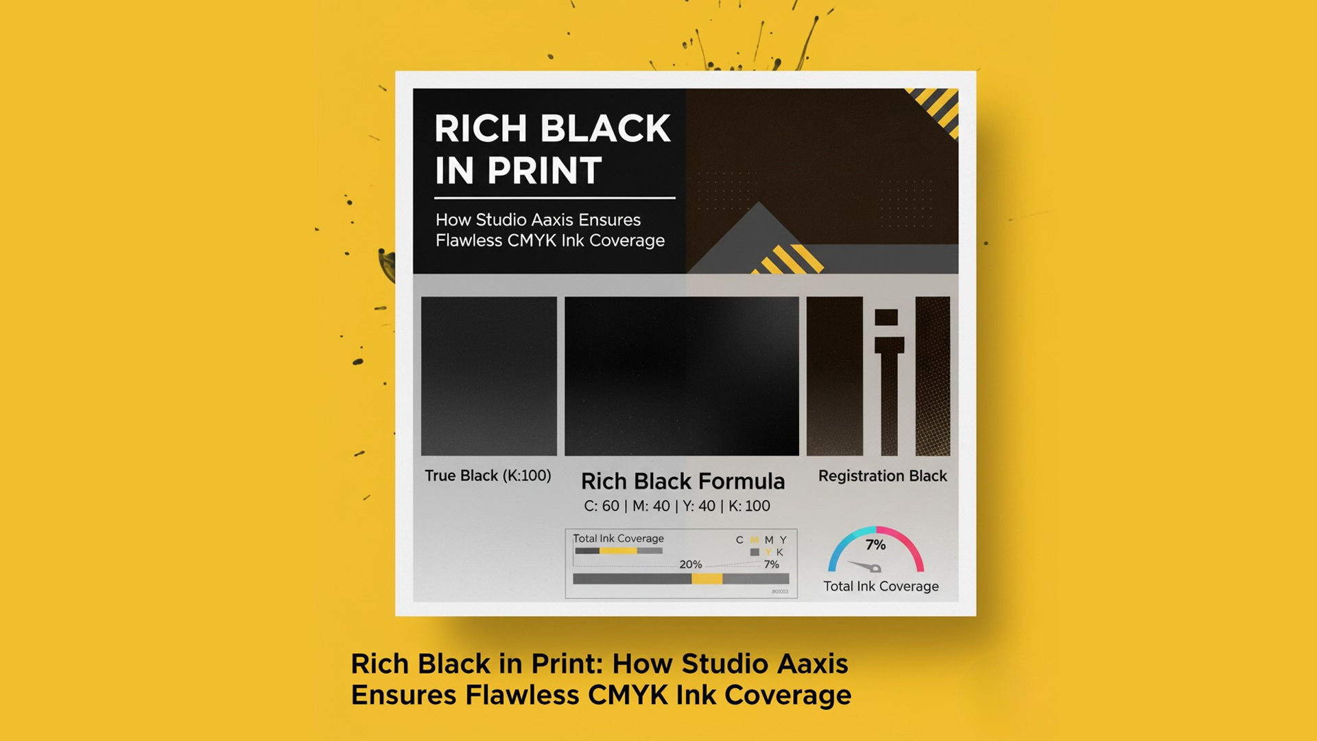
True Black (100K): The Only Choice for Small Text
For small text, fine lines, captions, and body copy, True Black (K:100) is the industry gold standard.
Why we always recommend True Black for text:
- Eliminates registration issues
- Ensures razor-sharp readability
- Prevents color fringing around letters
- Produces clean, professional print results
Using Rich Black for type is one of the most common—and expensive—mistakes in incoming artwork. Our pre-flight checks always correct this before files reach print.
Our Recommended Rich Black: C60 M40 Y40 K100
When your design needs presence, depth, and visual weight—such as backgrounds, bold shapes, and large solid areas—Rich Black is the right tool.
At Studio Aaxis, we rely on a proven formula:
**Rich Black Formula:
C: 60 | M: 40 | Y: 40 | K: 100**
Why this formula works:
- Creates a deep, elegant black
- Maintains a safe Total Ink Coverage
- Supports faster drying on offset presses
- Delivers consistent output across printers and substrates
This build is optimized for high-volume brand adaptations, ensuring artworks print reliably whether you’re producing a magazine ad in Delhi or a retail poster in Dubai.
Never Use Registration Black for Design Elements
Registration Black (100% in all four channels) is meant exclusively for printer’s marks.
If used in design:
- Ink coverage shoots to 400%
- Pages stick, smudge, or peel
- Printers reject the file
- Drying becomes unpredictable
At Studio Aaxis, one of our first quality checks is ensuring no Registration Black appears in design layers.
Color Accuracy Starts With Your Monitor
Perfect print output begins long before hitting “Export to PDF.”
Your monitor setup influences every color choice you make.
For reliable color representation:
- Use monitors with high sRGB coverage
- Calibrate them regularly
- Work in proper CMYK profiles for print jobs
- Understand the difference between on-screen RGB and printed CMYK
A calibrated setup prevents surprises during press checks and ensures that your design decisions actually translate into ink on paper.
Why CMYK Looks Different on Mobile Screens
Clients often review artwork on WhatsApp or email and immediately say, “The black looks different.”
Here’s the simple reason:
- Mobiles display RGB only
- CMYK artwork is auto-converted for screen preview
- Deep blacks and CMYK builds never translate one-to-one
This is normal. The printed sheet—not the mobile preview—is the true reference.
At Studio Aaxis, we help clients understand these nuances early in the workflow to avoid last-minute confusion.
Final Takeaway: Precision Creates Confidence
Black seems simple, but mastering it is a hallmark of professional print production.
By using:
- True Black for text
- Rich Black (C60 M40 Y40 K100) for large areas
- Zero Registration Black in design
- Proper TIC limits
- Calibrated screens
…you ensure your print output is sharp, rich, and reliable.
At Studio Aaxis, these checks are deeply embedded into our adaptation workflow.
Every file we touch is engineered for accuracy—because for global brands, consistency is everything.